Data Analysis Expressions (DAX) is a domain-specific language created by Microsoft and used in various Microsoft products, particularly in PowerBI. DAX was designed specifically for handling data models through a functional-style approach and can be used to calculate tables, columns & measures.
In this Blog Article, we’ll discuss what DAX is, why it was created, its main syntactic elements, what can be achieved with it, and its limitations regarding data processing. We’ll also discuss why some people consider it difficult and why others consider it “unsafe” and mention best practices that will hopefully avoid shooting ourselves in the foot while dashboarding with PowerBI.
We’ll be using DAX expressions & Python scripts, which can be found in the Blog Article Repo.
A Brief Context
When discussing languages for data analysis, two main contenders immediately come to mind:
- Python
- SQL
These are the two most common languages used by data analysts, and they form the foundation of a robust portfolio. However, there is another language that often goes unnoticed in a data analyst’s tech stack. This language is DAX, a domain-specific language utilized exclusively in certain Microsoft products, particularly in data visualization.
If you have explored Microsoft Excel extensively, you may be familiar with a feature called Power Pivot. It empowers users to create and manage data models for analysis and calculations by importing and combining data from diverse sources, establishing table relationships, and harnessing DAX formulas for calculations and custom measures.
DAX serves as the primary expression language within Power Pivot. We can think of Power Pivot as the younger sibling of Power BI. However, the primary application of DAX lies in a data visualization tool called Power BI. Both of these tools share the same underlying engine known as Tabular.
In this segment, we will delve into the discussion of DAX within the context of Power BI.
What is DAX?
Data Analysis Expressions (DAX) is a domain-specific formula expression language developed by Microsoft, designed to handle data models for several of its services:
- Microsoft PowerPivot
- Microsoft Power BI
- SQL Server Analysis
DAX was developed as part of Project Gemini and was first introduced in 2009 with the release of the PowerPivot for Excel 2010 Add-in. Since then, it has become an essential tool in Data Analysis and Business Intelligence, especially within the context of Power BI Desktop.
DAX encompasses functions used in Excel formulas while introducing additional functions tailored to work with relational data and perform dynamic aggregation. It can be seen as an evolution of the Multidimensional Expression (MDX) language developed by Microsoft for Analysis Services multidimensional models, combined with Excel formula functions.
In essence, DAX can be defined as follows:
- It is a formula-based language utilized for dynamically manipulating tabular data.
- It finds significant applications in Power BI Desktop for manipulating tabular data, though not exclusively.
- It is a domain-specific language widely embraced by the Data Analysis and Business Intelligence community.
Why is DAX relevant?
DAX holds great relevance in the world of data analysis and business intelligence for several reasons:
1. Adoption rate
When discussing data visualization tools, three main players dominate the market:
- Power BI: Tailored for business intelligence (BI) applications.
- Tableau: Tailored for interactive charts.
- Qlik Sense: Tailored for independent and more niche solutions.
As we’ve discussed, DAX, along with Power Query M, are the main expression & querying languages used in Power BI. This means that if we want to use Power BI, learning DAX is almost guaranteed to be required (we can stick with simply dragging and dropping columns in visuals, and we would be fine if that’s what we’re after, but we would be heavily underusing Power BI’s full capabilities).
2. DAX as a language
DAX provides a powerful and efficient formula-based language specifically designed for manipulating tabular data. This makes it a valuable tool for performing calculations, creating custom measures, and aggregating data dynamically. Also, it’s sufficiently flexible to provide multiple ways of achieving the end results; as we’ll discuss in more detail later on, there are multiple ways we can use to introduce DAX into our analyses.
3. DAX with BI visuals
DAX works hand-in-hand with Power BI visuals, enabling us to create interactive and insightful data visualizations; we can think of DAX as the engine behind any dynamic visual we choose to include.
The truth is, we can do a lot with this powerful synergy: from sophisticated calculations and advanced filtering to dynamic visualizations and the generation of interesting insights that can be explored with the simple use of a cursor. This DAX-Power BI Visuals integration lets us deliver compelling and actionable insights in the simplest way possible.
4. Dashboard publication & embedding
Power BI allows for easy publication and embedding of dashboards and reports. With DAX as the backbone, we can create interactive dashboards that can be shared with others and embedded into various platforms. This makes it simple to distribute our data-driven insights to a wider audience using a single hyperlink.
Why is it hard?
At first glance, DAX is simple; its syntax is straightforward, and there are a limited number of expressions we can use. However, people find learning & writing DAX a fair challenge. This is because, even though DAX is simple, it’s not easy:
- It’s a strictly functional language, meaning one single function will always be evaluated, and its result returned on each measure.
- Related to the point above, the order of evaluation is not linear (imperative), meaning that the execution flow will not be from A to B to C; it will instead depend on the expressions we use and how we use them.
- Even though the syntax is simple, the functions can get complex very easily because we often need to nest expressions inside other expressions to get what we’re looking for.
- There are many ways to achieve the same result; we can play with different combinations of expressions that will yield better or worst execution performance, depending on how we’re writing them.
- The evaluation of formulas (when calculating measures) is dynamic, meaning it changes when we apply filters in our visuals (more on this later)
- The evaluation context is sometimes hard to decipher if we’re not careful with how we build our formulas.
- The errors are often hard to debug; because of the points above, we may have a bug in our code related, for example, to the evaluation context. This means that, at first glance, our code might be working correctly, but once we apply a filter or put our calculation under a specific context, the results are incorrect.
- We also need to worry about the data modeling aspect of our structure; it’s not enough to write good DAX code. We also need to be careful about how we model our data behind the scenes. If we’re not careful and design an underperforming data model, our formulas will result in added execution times, sometimes leading to memory errors on the client side. Additionally, if we design our data model poorly, we might end up with incorrect calculations.
Main features
DAX is a feature-rich language that offers vast analysis capabilities; it also provides flexibility when working with more complex information and can be combined seamlessly with Power BI visualizations.
DAX has six main features:
- It enables dynamic manipulation.
- It provides flexibility to create measures, columns & tables.
- It enables defining relationships between data tables.
- It provides aggregation and filtering functions for data manipulation.
- It allows variable definitions inside expressions.
- It allows referencing other expressions inside other formulas.
1. Dynamic manipulation
When discussing dynamic manipulation, we refer to the ability to calculate based on selections dynamically. For example, we may define a simple expression that calculates the average of all ages in a given column and then apply a filter to select only females; the expression will update automatically.
In DAX, we have four main ways to execute calculations:
- Measures in the visual directly
- Calculated measures
- Calculated columns
- Calculated tables
Dynamic manipulation in DAX is achieved via the first two mechanisms:
- Measures in visuals.
- Calculated measures.
This is because a measure is evaluated in the cell context evaluated in a report or a DAX query. In contrast, a calculated column is computed at the row level within the table it belongs to. When talking about calculated measures, the context of the cell depends on user selections in the report or the shape of the DAX query, while the context of a calculated column will always belong to the table containing the calculated column.
2. Measures, columns & tables
We already mentioned the four ways to calculate things in Power BI using DAX. Each method of calculation has its advantages and disadvantages:
- Measures in visuals:
- If we have a table containing Person’s Name, Age, and Gender, we can grab any of these and include them directly in a visual by performing some type of aggregation or simply displaying them without previous calculations.
- Calculated measures:
- Are evaluated on the fly.
- Inherit the context of the user selection.
- Can take more time to process if the calculation is complex or involves large amounts of data.
- Calculated columns:
- They are pre-evaluated (once they are defined).
- Since they do not change context on user selection, they are not recalculated upon filtering.
- Can take more memory if the data model is large enough.
- Calculated tables:
- They are also pre-evaluated.
- They do not change the context on user selection.
- Can take significantly more memory, depending on the aggregation we’re performing on the data model.
3. Relationship definitions
Like other RDMSs, we often work with multiple tables in Power BI. When working in our data model, we can define relations between tables just as we would do while using an SQL system.
With DAX, we can leverage these relations either directly by simply calculating the related fields or by explicitly specifying a related field using the RELATED collection of expressions.
4. Aggregation & filtering
DAX has a powerful set of aggregation & filtering expressions:
Below are some examples of aggregation expressions:
- Sum: Calculates the sum of a numeric column.
- Example:
SUM([Sales])
- Example:
- Average: Calculates the average of a numeric column.
- Example:
AVERAGE([Price])
- Example:
- Minimum: Retrieves the minimum value from a column.
- Example:
MIN([Quantity])
- Example:
- Maximum: Retrieves the maximum value from a column.
- Example:
MAX([Revenue])
- Example:
- Count: Counts the number of non-blank values in a column.
- Example:
COUNT([ProductID])
- Example:
- Count Distinct: Counts the number of unique values in a column.
- Example:
DISTINCTCOUNT([CustomerID])
- Example:
- Median: Calculates the median value of a numeric column.
- Example:
MEDIAN([Age])
- Example:
- Mode: Retrieves the mode (most frequently occurring value) from a column.
- Example:
MODE([Color])
- Example:
- Standard Deviation: Calculates the standard deviation of a numeric column.
- Example:
STDEV.P([Quantity])
- Example:
- Variance: Calculates the variance of a numeric column.
- Example:
VAR.P([Revenue])
- Example:
Below are some examples of filtering expressions:
Basic Filtering:- Example:
[Product] = "Apples"
- Example:
- Multiple Conditions:
- Example:
[Category] = "Fruits" && [Price] > 10
- Example:
- Text Filtering:
- Example:
CONTAINS([ProductName], "Apple")
- Example:
- Date Filtering:
- Example:
[OrderDate] >= DATE(2022, 1, 1)
- Example:
- Top N Filtering:
- Example:
TOPN(5, [Sales], [Category])
- Example:
- Range Filtering:
- Example:
[Quantity] BETWEEN 10 AND 50
- Example:
- IN Operator:
- Example:
[Region] IN ("North", "South")
- Example:
- NOT Operator:
- Example:
NOT [Status] = "Completed"
- Example:
- IsBlank Function:
- Example:
ISBLANK([CustomerName])
- Example:
- OR Operator:
- Example:
[Category] = "Fruits" || [Category] = "Vegetables"
- Example:
These are just some examples, but DAX offers a wide variety of expressions we can use.
5. Variable definitions
DAX lets us define variables inside our functions. This is helpful when we have several intermediate calculations and want to keep our code clean and organized.
A variable can be defined using the following syntax:
Code
BirthContributionPerRegion =
VAR BirthsCountry =
CALCULATE(
    SUM(demographics[Births])
    )

VAR BirthsRegion =
CALCULATE(
    SUM(demographics[Births]),ALL(countries[Country])
)

RETURN
CALCULATE(
    DIVIDE(BirthsCountry, BirthsRegion)
)A variable inside a measure must always be accompanied by a return statement. For example, in our calculation, we’re defining two variables using the VAR keyword, and returning the division of the result of the two, using the RETURN keyword.
This syntax is cleaner than if we were to define the entire calculation in one statement. More importantly, variables provide greater readability improvements when we’re working with extensive functions.
6. Referencing other expressions
DAX also allows us to reference other expressions from inside a function. This is extremely useful when we have multiple intermediate expressions that we’re using in other visuals and would like to build new expressions from those.
A reference to another measure can be accomplished using the following syntax:
Code
BirthsPerCountry =
CALCULATE(
    SUM(demographics[Births])
)Code
BirthsPerRegion =
CALCULATE(
    SUM(demographics[Births]),ALL(countries[Country])
)Code
BirthContributionPerRegion =
CALCULATE(
    DIVIDE([BirthsPerCountry], [BirthsPerRegion])
)This way, we’re first defining two calculated measures, and we’re then defining a new expression that uses the first two as a basis, eliminating the need to repeat the code of our first expressions in the second one; we can, of course, reutilize the first expressions in any other calculation we require.
Main components
DAX is composed of 8 main key parts:
- Expression: DAX expressions define calculations and logic. Expressions are the building blocks of formulas.
- Formula: Formulas are a combination of expressions and operators to perform more complex calculations.
- Evaluation: Formulas dynamically calculate results within the context of a data model.
- Result: DAX formulas evaluate and return results that can be used in visualizations or other formulas.
- Functions: DAX provides built-in functions for various calculations.
- Context: The context determines the subset of data being considered.
- Iteration: DAX supports iterative calculations with functions like
SUMXandCALCULATE. - Data Model: DAX works with tabular data models that organize data into tables with relationships.
Typically, we would approach the creation of DAX formulas using the following steps:
- We start with a data model with one or more tables and one or more columns each.
- We then consider whether we require a dynamic or fixed context.
- Depending on the decision above, we either create calculated measures, columns, or tables. We start building formulas containing expressions.
- Depending on what we’re trying to calculate, we can use aggregation expressions, iterators, filters, conditional statements, and many more.
- We then take the formula and include it somewhere in our dashboard. This is usually achieved via predefined or custom visuals; however, we can also let the formulas as intermediate steps for other calculations.
Now that we have a clearer workflow for generating DAX calculations, we can put it into practice by following a very simple practical exercise.
A practical example
For this practical example, we’ll use two datasets which can be found in the links below:
- World Happiness Report up to 2022, Mathurin Aché, Kaggle
- Demographic Indicators, United Nations Department of Economic and Social Affairs, UN Data
Our objective is to build a simple Power BI dashboard that uses the following contexts:
- Country
- Year
To produce information & visuals around the following information:
- Life expectancy
- Net migration
- Population growth rate
- Happiness score
1. Preparing the data
We’ll need to do some preprocessing before we include our datasets in our Power BI data model. This is a very common practice when using Power BI since BI is not fit for preprocessing; it shines when we already have somewhat clean, structured, and aggregated data, preferably consisting of one table per dimension (for those unfamiliar with data modeling, the most popular way to model data from a relational standpoint is called a star schema). However, we can still do some cleaning in Power Query M, although that’s not the focus of this segment, so we’ll not mention it in detail.
For the data preprocessing step, we’ll use a simple Jupyter Notebook with Python. The complete notebook can be found here. For those only interested in the DAX part f this segment, the preprocessed datasets can be found here.
We’ll start by importing some modules and setting up some parameters for Pandas:
Code
import pandas as pd
pd.set_option('display.max_columns', None)
import osWe’ll then define our directory parameters:
Code
# Define directories
rDir = "data"
wDir = "outputs"
happinessData = os.path.join(rDir, "world-happiness-index")
demographicsData = os.path.join(rDir, "world-demographics/WPP2022_Demographic_Indicators_Medium.csv")Here, happinessData and demographicsData refers to the datasets we previously downloaded, so they should live inside the data directory.
We’ll then load our raw world happiness files as Pandas DataFrames, and concatenate them so we end up with one single object containing all years:
Code
df_list = []
for file in os.listdir(happinessData):
    year = file.split('.')[0]
    print(f"Reading year: {year}")
    df = pd.read_csv(os.path.join(happinessData, file))
    df['Year'] = year
    df_list.append(df)

df_happiness_idx = pd.concat(df_list)
df_happiness_idx.head()Next, we can confirm the columns we have in our object and only keep the ones we’re interested in:
CountryRegionHappiness RankHappiness ScoreStandard ErrorEconomy (GDP per Capita)FamilyHealth (Life Expectancy)FreedomTrust (Government Corruption)GenerosityDystopia Residual
Code
happiness_idx_columns = ['Country',
                         'Region',
                         'Year',
                         'Happiness Rank',
                         'Happiness Score',
                         'Standard Error',
                         'Economy (GDP per Capita)',
                         'Family',
                         'Health (Life Expectancy)',
                         'Freedom',
                         'Trust (Government Corruption)',
                         'Generosity',
                         'Dystopia Residual']

df_happiness_idx = df_happiness_idx[happiness_idx_columns]We’ll then do some cleaning and renaming:
Code
df_happiness_idx.dropna(subset = ['Country'], inplace=True)
df_happiness_countries = list(df_happiness_idx['Country'].unique())
df_happiness_countries.sort()
df_happiness_countriesOutput
['Afghanistan',
 'Albania',
 'Algeria',
 'Angola',
 'Argentina',
 'Armenia',
 'Australia',
 'Austria',
 'Azerbaijan',
 'Azerbaijan*',
 'Bahrain',
 'Bangladesh',
 'Belarus',
 'Belarus*',
 'Belgium',
 'Belize',
 'Benin',
 'Bhutan',
 'Bolivia',
 'Bosnia and Herzegovina',
 'Botswana',
 'Botswana*',
 'Brazil',
 'Bulgaria',
 'Burkina Faso',
...
 'Yemen',
 'Yemen*',
 'Zambia',
 'Zimbabwe',
 'xx']
It appears we have some duplicates and an xx country name. We’ll remove those:
Code
df_happiness_countries = [country for country in df_happiness_countries if '*' not in country and 'xx' not in country]
df_happiness_idx = df_happiness_idx[df_happiness_idx['Country'].isin(df_happiness_countries)].reset_index(drop=True)Great, so now what’s left is to load the demographics dataset, keep only the columns we’re interested in, compare countries, and select only the ones that are common to both sets:
Code
df_demographics = pd.read_csv(demographicsData)
df_demographics = df_demographics[(df_demographics['LocTypeName'] == 'Country/Area') & (df_demographics['Time'].isin([2015, 2016, 2017, 2018, 2019, 2020, 2021, 2022]))].reset_index(drop = True)
df_demographics.rename(columns = {'Location': 'Country',
                                  'Time': 'Year'},
                                  inplace=True
                        )
df_demographics = df_demographics[['Country', 'Year', 'PopDensity', 'PopSexRatio', 'MedianAgePop', 'PopGrowthRate', 'Births', 'Deaths', 'DeathsMale', 'DeathsFemale', 'NetMigrations']]
(df_demographics['Country'].nunique(), df_happiness_idx['Country'].nunique())Output
(237, 170)We can see that we have a larger number of unique countries/areas in the demographics dataset, so we’ll need to filter out the ones that are unique to a given dataset:
Code
countries_consolidated = [country for country in df_demographics['Country'].unique() if country in df_happiness_idx['Country'].unique()]
df_demographics = df_demographics[df_demographics['Country'].isin(countries_consolidated)].reset_index(drop=True)
df_happiness_idx = df_happiness_idx[df_happiness_idx['Country'].isin(countries_consolidated)].reset_index(drop=True)Finally, we’ll create a country ID number; this step is not required as we can create connections in our model using the actual country name. However, it’s always good practice to set up a unique numeric ID for fields that we’ll use for relationships in our data model:
Code
country_list = df_demographics['Country'].unique()
country_list.sort()
country_identifiers = list(range(1, len(country_list) + 1))
country_ids = dict(zip(country_list, country_identifiers))Since we have an identifier we can now use instead of the full country name, we can create a new DataFrame composed of all the unique countries and add a Region column using the df_happiness_idx region mapping:
Code
df_countries = pd.DataFrame(country_ids.items(), columns = ['Country', 'Country_ID'])
df_happiness_idx['Country_ID'] = df_happiness_idx['Country'].map(country_ids)
df_demographics['Country_ID'] = df_demographics['Country'].map(country_ids)
regions = df_happiness_idx.drop_duplicates('Country_ID').set_index('Country_ID')['Region']
df_countries['Region'] = df_countries['Country_ID'].map(regions)Lastly, we simply drop the unnecessary columns from our original DataFrames, and write our results to CSV files:
Code
df_happiness_idx.drop(columns = ['Country', 'Region'], inplace=True)
df_demographics.drop(columns = ['Country'], inplace=True)Code
df_countries.to_csv(os.path.join(wDir, 'countries.csv'), index=False)
df_happiness_idx.to_csv(os.path.join(wDir, 'happiness_index.csv'), index=False)
df_demographics.to_csv(os.path.join(wDir, 'demographics.csv'), index=False)2. Creating our data model in Power BI
The next step is to import our data to a Power BI file. For this, we follow the steps below:
- Head to Power BI Desktop
- Select “Get data“
- Select “Text/CSV“
- Select the first file we wish to import, which can be
countries.csv. - We’ll select “Transform Data“, and the Power Query Editor will open.
- We’ll import the other two datasets into our model by repeating steps 2 to 4 from inside the Power Query Editor.
- We’ll finally make sure we have the correct data types for each column for each dataset:
For countries:
{{"Country", type text}, {"Country_ID", Int64.Type}, {"Region", type text}})For happiness_index:
{{"Year", Int64.Type}, {"Happiness Rank", Int64.Type}, {"Happiness Score", type number}, {"Standard Error", type number}, {"Economy (GDP per Capita)", type number}, {"Family", type number}, {"Health (Life Expectancy)", type number}, {"Freedom", type number}, {"Trust (Government Corruption)", type number}, {"Generosity", type number}, {"Dystopia Residual", type number}, {"Country_ID", Int64.Type}}For demographics:
{{"Year", Int64.Type}, {"PopDensity", type number}, {"PopSexRatio", type number}, {"MedianAgePop", type number}, {"PopGrowthRate", type number}, {"Births", type number}, {"Deaths", type number}, {"DeathsMale", type number}, {"DeathsFemale", type number}, {"NetMigrations", type number}, {"Country_ID", Int64.Type}}Once we’re happy with our model, we simply select “Close & Apply“.
If we head to “Model view“, we should have something like such:
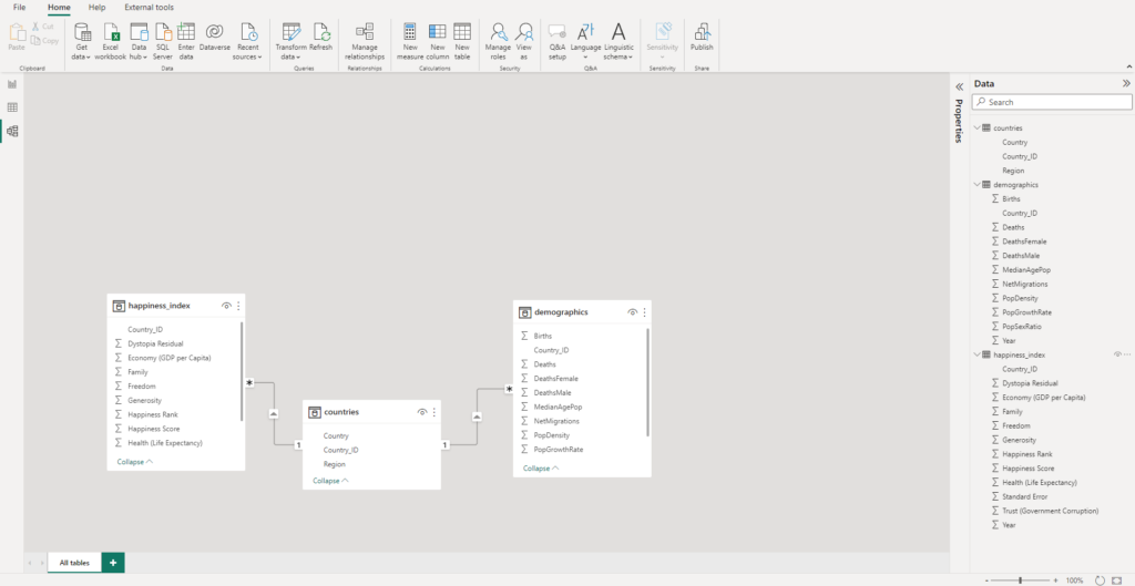
We can proceed to save our Power BI file.
3. Creating a simple dashboard
Since this segment focuses on DAX calculations and not the visualizations themselves, we’ll limit the creation of visuals to very simple ones.
We’ll create five different groups of visualizations:
- Population Density Index table & bar chart.
- Net Migration vs. Happiness Score scatterplot & bar chart.
- Life Expectancy in affinity by region & whole world.
- Ranking of Life Expectancy percentage difference vs. regions & the entire world.
3.1 Population Density Index
We’ll start by including a table with the following:
- The
Countryfield in our table. - The Population Density Index in our table:
- The index version of this indicator takes the previous year and calculates the percentage change vs. the current year.
- The
Yearfield as a filter.
Since we have the Population Density indicator as an absolute value, we need to convert it to an index. We can head to the “Data view” pane and create a new measure called PopDensityIndex. In this measure, we want to calculate the percentage change in population density by taking the previous year as a reference:
Code
PopDensityIndex =
VAR currYear = MAX(demographics[Year])
VAR prevYear = currYear - 1
VAR popDensityCurr =
CALCULATE(
    AVERAGE(demographics[PopDensity]),
    demographics[Year] = currYear
)
VAR popDensityPrev =
CALCULATE(
    AVERAGE(demographics[PopDensity]),
    demographics[Year] = prevYear
)
RETURN
CALCULATE(
    DIVIDE(popDensityCurr, popDensityPrev) - 1
)What we’ve done here is:
- Create a new DAX measure, and name it
PopDensityIndex - Create four variables:
currYear: The current year (selected year) by our filter.prevYear: The previous year from the currently selected year.popDensityCurr: The population density calculated for the current year.popDensityPrev: The population density calculated for the previous year.
- Return the percentage change of the current density vs. the previous one.
As mentioned earlier, measures change depending on the filters we use. This means we can include a filter containing the Year field, and the currYear & prevYear variables will change whenever we select a different year.
Let us test this by creating two visuals and including a slicer including the Year field:
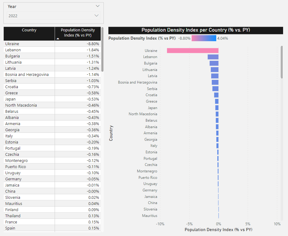
Since we selected 2022 in our slicer, the calculated measure will reflect this and set the current year as 2022. This is achieved by using the MAX function.
If we select another year, the results will change accordingly, and the maximum year will now be the selected year:
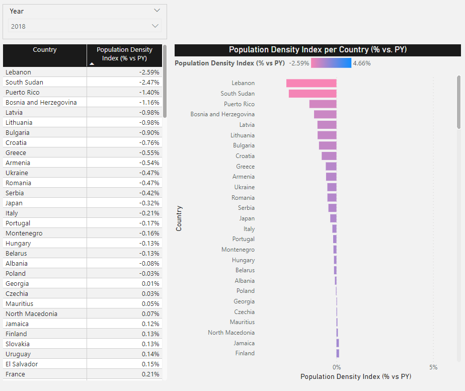
3.2 Net Migration vs. Happiness Score
The Net Migration rate is defined as the number of immigrants minus the number of emigrants over a period, divided by the person-years lived by the receiving country’s population over that period. It is expressed as the net number of migrants per 1,000 population.
The Happiness Score is normally calculated using data from the Gallup World Poll surveys. They are based on answers to the main life evaluation question asked in the poll. This is called the Cantril ladder: it asks respondents to think of a ladder, with the best possible life for them being a 10 and the worst possible life being a 0. They are then asked to rate their current lives on a 0 to 10 scale. The rankings are from nationally representative samples.
We would like to see if a low Happiness Score is correlated with the Net Migration rate in any given country.
To do this, we can use a scatterplot:
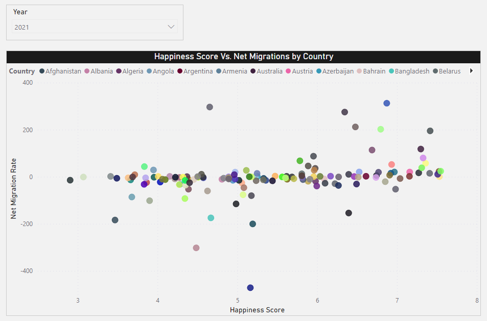
This already looks somewhat promising, but we’d like to explore this further, maybe on a higher aggregation level. If we recall from our original data, we have a Region field that we can leverage to calculate averages by world regions. We can then vertically stack two bar charts containing the following:
- Happiness Index
- Net Migration Ratio
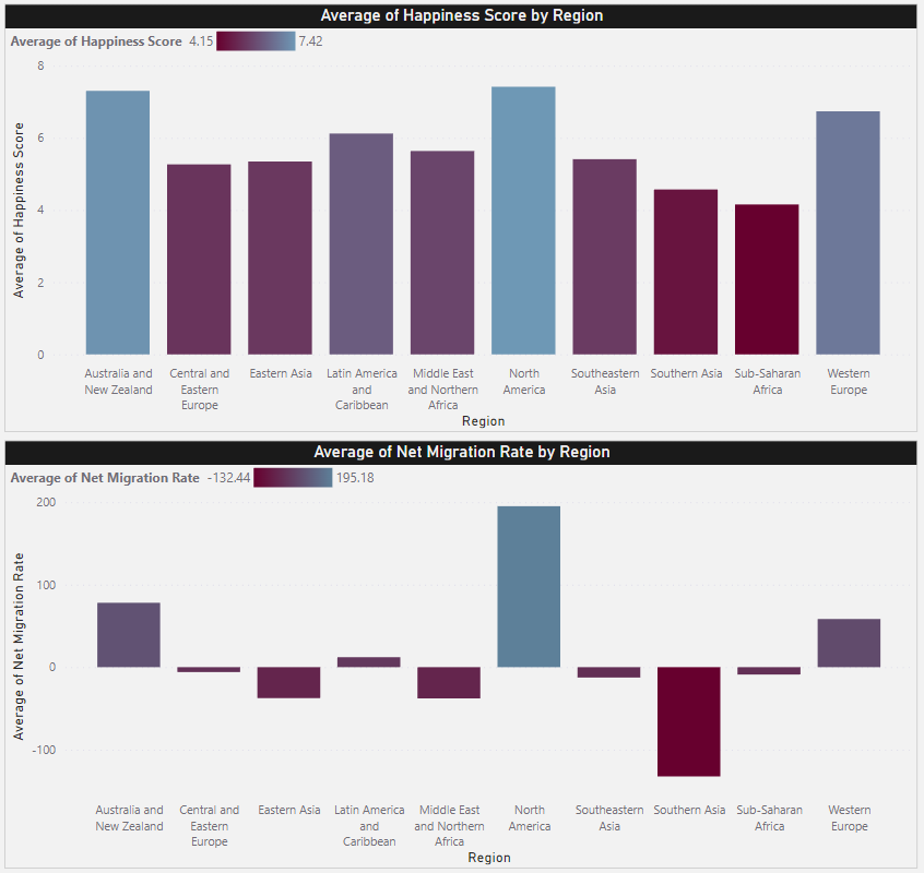
We’re also coloring each bar by using a gradient that, in both cases, sets the lower values to red colors and the higher values to blue colors.
3.3 Life Expectancy in affinity by region & whole world
Affinity is defined as a similarity with other units of aggregation. For example, affinity by region refers to countries that coexist on the same continent; this concept is extremely useful since it lets us perform calculations on different levels of aggregation by similar units.
Therefore, we can do the following:
- Calculate life expectancy for each country
- Calculate life expectancy for coexisting countries (in the same region/continent)
- Calculate life expectancy for the entire world (all regions grouped together)
This would quickly tell us, in a single visual, if a given country is above or below other similar countries in terms of life expectancy. For this, we’ll first create a DAX measure that calculates the average life expectancy for coexisting countries:
Code
AffinityLifeExpectancy =
CALCULATE(
    AVERAGE(happiness_index[Health (Life Expectancy)]),
    ALL(countries),
    VALUES(countries[Region])
)But we would also like to calculate the percentual difference between the country and its corresponding region, right? For that, we can create another DAX measure:
Code
LifeExpectancyPercDiffFromRegion =
CALCULATE(
    DIVIDE(AVERAGE(happiness_index[Health (Life Expectancy)]), [AffinityLifeExpectancy]) - 1
)Great! Now we only need to calculate the world average and create the same percentual difference metric for this new implementation:
Code
LifeExpectancyWorldAverage =
CALCULATE(
    AVERAGE(happiness_index[Health (Life Expectancy)]),
    ALL(countries[Country])
)Code
LifeExpectancyPercDiffFromWorld =
CALCULATE(
    DIVIDE(AVERAGE(happiness_index[Health (Life Expectancy)]), [LifeExpectancyWorldAverage]) - 1
)So we now have a table visual as such:
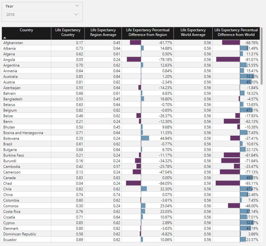
Which includes:
- List of countries.
- Life expectancy by country.
- Average life expectancy by coexisting countries in the region.
- Percentual difference between the last two measures.
- Average life expectancy for the whole world.
- Percentual difference between each country’s life expectancy and the average world’s life expectancy.
This gives us a nice picture of the following:
- How are countries doing in terms of life expectancy in general.
- How are they doing when compared to their region.
- How are they doing when compared to the entire world.
These calculations are extremely valuable since, for example, we can easily spot countries with prevalent humanitarian crises using the fourth indicator; the region is doing fine, but the country is presenting challenges. So, the lower the percentual difference, the more drastic the country values are compared to the total region.
3.4 Ranking of Life Expectancy percentage difference vs. regions & the entire world
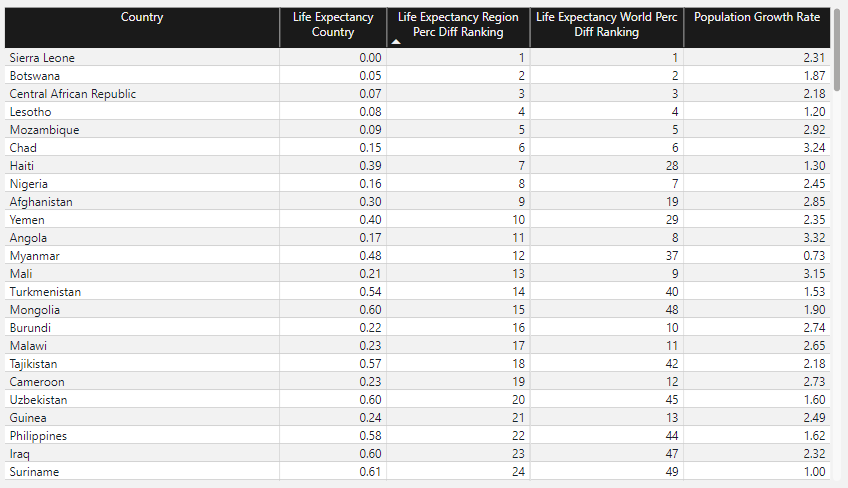
We can complement the chart above by ranking countries based on their life expectancy percentual difference vs. their regions and vs. the entire world:
Code
LifeExpectancyRegionRank =
RANKX(ALL(countries[Country]), [LifeExpectancyPercDiffFromRegion], , ASC, Dense)Code
LifeExpectancyWorldRank =
RANKX(ALL(countries[Country]), [LifeExpectancyPercDiffFromWorld], , ASC, Dense)And generate a new table that contains both ranks, along with the Population Growth Rate index:
Next Steps
This was by no means an in-depth review of DAX. Instead, it was meant to show why the language is popular among Data Analysts & Data Scientists and, hopefully, inspire people to give it a try. There are a wide variety of features that we left uncovered, and that is for a reason; DAX can become complex extremely quickly, and to really write quality DAX code, we must learn it from the basis; unlike other languages, perhaps, with DAX it’s not enough to memorize some methods and start writing code just like that. It requires considerable time to understand what’s happening behind the curtains and, most importantly, how the evaluation contexts are managed.
For this, there are thousands of free resources available out there. Below are some options which I think are the best there is:
Disclaimer: The material provided below is of my own selection and contains no referral links or associated promotions.
First stops:
- Power BI Community, Microsoft: The single-handed best option for any type of question related to DAX & Power Query M. The answers are provided by experts in the field, including Microsoft developers.
- Power BI Learning Path, Microsoft: A comprehensive collection of free training resources, ranging from basics to more elaborate topics.
- Power BI documentation, Microsoft: Sometimes, heading to the official documentation and directly consulting information is the best way to know the language. This page includes all the information we might need to start with Power BI and build a strong sense of it with time.
YouTube Channels:
- SQLBI: An excellent channel created by Power BI experts Alberto Ferrari & Marco Russo. Content ranges from beginner to advanced level and covers practically everything we might want to know regarding DAX & Power Query M.
- Curbal: Another excellent resource covering Power BI Desktop & DAX, as well as other Data Analysis languages such as Python and R.
- Kevin Stratvert: A great channel managed by Kevin Stratvert, ex-Microsoft Program Manager & Microsoft MVP for Windows, covering a wide portfolio of Microsoft products.
Conclusions
In this segment, we’ve discussed what DAX is, why it’s useful, its main use cases, what types of DAX calculations can be composed in a Power BI dashboard, and the main difference between them. We also introduced a simple example involving two datasets, where we created a very simple data model in BI and then proceeded to compose some simple calculations. We then introduced the calculations in visuals and explained how we could interpret them in the context of our data.
DAX is a very powerful tool in any data-related professional’s toolbox. It lets us build complex dynamic formulas that can be applied to many contexts. It also provides flexibility on how to model our data and how to work with it in the most efficient way possible. Hand-in-hand with visualization design techniques, there is little DAX cannot do in terms of the fundamentals of data visualization.

